When you think of grey, what shades of grey color come to your mind..??? And when you think of grey what comes to your mind? A rainy day? A foggy morning? The color grey often evokes a sense of neutrality, balance, and subtle sophistication. But beyond its quiet demeanor, grey offers a versatile and dynamic palette that can transform any space, artwork, or wardrobe. Grey is no longer the plain, colorless tone it was once thought to be; it has evolved into a canvas for depth, expression, and style. In this article, we’ll dive into the captivating world of grey, exploring its various shades, significance, applications, and how it’s used across different fields.

Table of Contents
1. Understanding the Basics of Grey
Grey is often described as an intermediate color between black and white. In technical terms, grey is an achromatic color, which means it lacks hue. It’s a result of mixing equal amounts of black and white or other complementary colors in specific proportions. However, within the scope of grey, there exists a range of tones that can either lean warm or cool, light or dark. This makes it one of the most versatile colors, able to blend seamlessly with any color scheme or design.
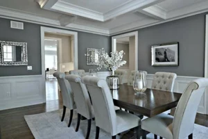
2. Shades of Grey color: The Full Spectrum
Grey doesn’t have to be “just grey.” From the faintest whisper of silver to the deepest charcoal, there are numerous shades of grey to explore. Here are some of the most popular tones and what they evoke:
a. Light Grey
Light grey is often associated with purity and simplicity. It’s soft and unobtrusive, making it a popular choice for minimalist designs and Scandinavian-inspired interiors. Light grey works well as a neutral base, pairing beautifully with pastel tones or darker accents.
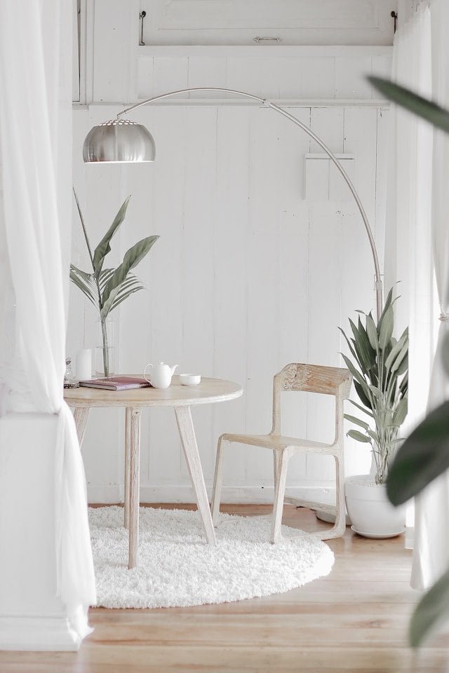
b. Silver Grey
Silver grey has a slight shimmer, giving it a metallic feel that brings a modern, sleek vibe. This shade is popular in technology (think of gadgets) and is also widely used in fashion. It adds sophistication and elegance without being too bold.
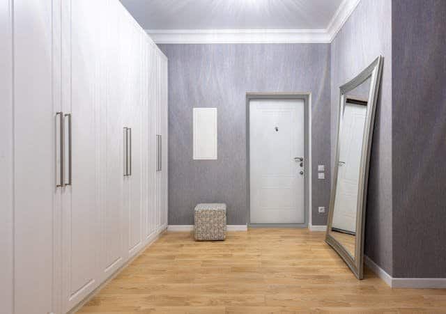
c. Ash Grey
Ash grey has a hint of warmth, often described as a “dirty grey.” It is a little less formal, which makes it perfect for adding a relaxed and grounded feel to an environment. It’s commonly used in rustic and industrial designs.
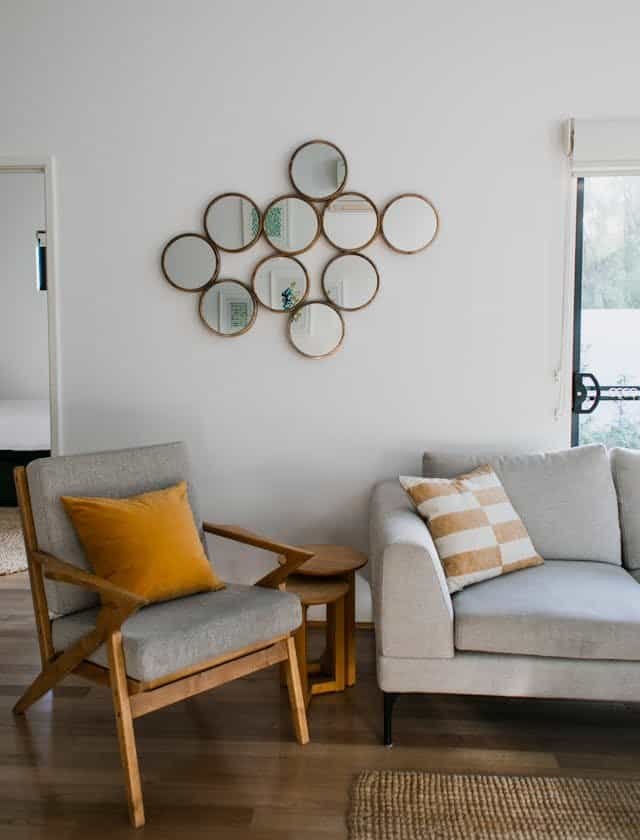
d. Dove Grey
Dove grey is soft, gentle, and slightly warm. Named after the feathers of a dove, it’s a peaceful shade of grey often used in bedroom decor and cozy spaces where relaxation is key. It pairs well with whites, soft blues, and greens.

e. Slate Grey
Slate grey has blue undertones, giving it a cool and dramatic vibe. This shade is frequently used in contemporary design to create a bold contrast. Slate grey is popular for walls, tiles, and even kitchen cabinetry as it adds an element of sophistication and depth.

f. Charcoal Grey
Charcoal grey is a deep, dark shade that borders on black but retains the softness of grey. This shade exudes strength, confidence, and modernity. It’s commonly used in high-end fashion, architecture, and interior design for an elegant yet understated look.
g. Graphite Grey
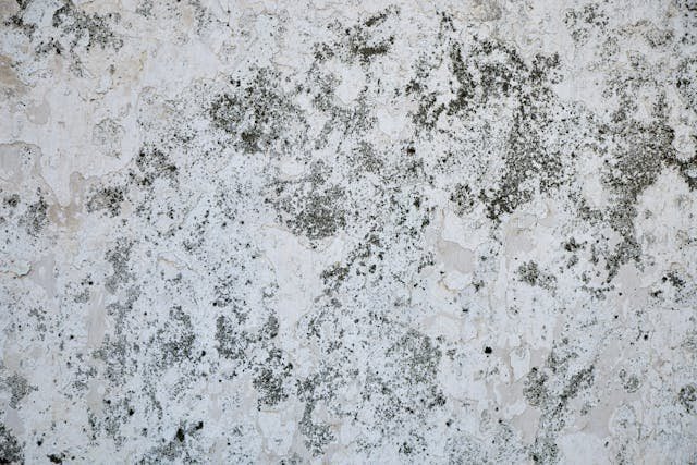
Graphite grey is similar to charcoal but with a slightly warmer tone. It’s darker and adds a feeling of mystery and sophistication. This shade is perfect for luxurious spaces, where it can add a grounding effect to brighter accents.
3. The Symbolism and Psychology of Grey
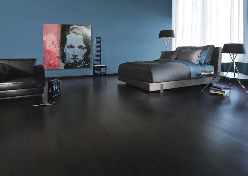
Grey is often seen as a color of neutrality and balance, as it sits between the extremes of black and white. Psychologically, grey represents calmness, composure, and sophistication. Unlike brighter colors, grey doesn’t provoke strong emotions but instead creates a soothing environment, which is why it’s often chosen for interior design.
In fashion, grey conveys elegance and professionalism. It’s commonly used in business attire as it’s seen as a stable, reliable color. Grey can also reflect wisdom and maturity, as it’s associated with age and experience.
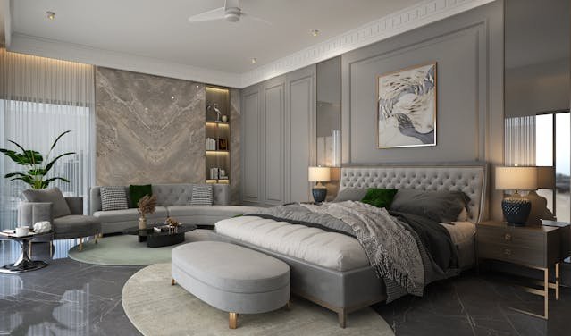
On the flip side, grey can sometimes represent indecision or a lack of confidence, as it’s a neutral color that doesn’t lean toward a definitive “yes” or “no.” Despite this, the versatility of grey means it can be molded to fit a range of moods and expressions, from comfort to refinement.
4. Applications of Grey in Interior Design
a. Grey as a Neutral Base
Grey is the ideal neutral for creating a cohesive space. It acts as a canvas, allowing other colors to shine while still adding depth. For example, pairing light grey walls with vibrant accent colors like mustard yellow or teal creates a balanced and modern aesthetic.
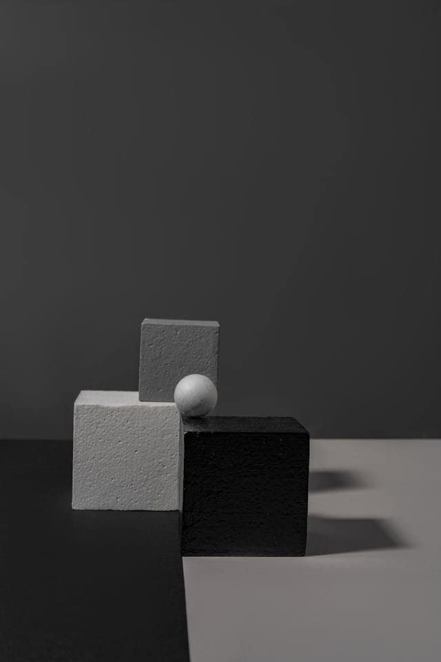
b. Monochromatic Grey Palettes
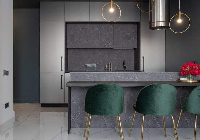
A monochromatic grey palette can be visually stunning when done correctly. By layering different shades of grey, designers can add texture and visual interest without overwhelming the space. This approach works well in minimalist and contemporary interiors, creating a sophisticated and calming atmosphere.
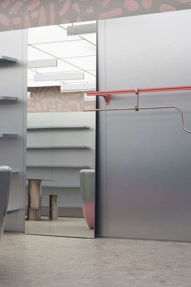
c. Grey with Metallic Accents
Grey pairs beautifully with metallics like silver, gold, and copper. These accents add a touch of glamour to an otherwise subdued color scheme. For instance, a dark grey wall with golden fixtures can create a luxurious feel, while silver and chrome with light grey adds a modern edge.
d. Warm vs. Cool Grey in Different Rooms
Choosing between warm and cool greys is essential in setting the mood. Cool greys with blue undertones are great for high-energy areas like kitchens and bathrooms, while warm greys with yellow or brown undertones work well in cozy spaces like living rooms and bedrooms.

5. The Role of Grey in Fashion
a. The Power of Grey Suits
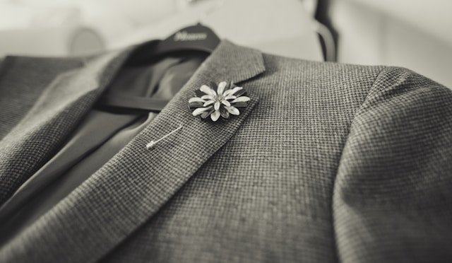
Grey is a classic choice in business fashion, especially in the form of suits. Light grey suits are perfect for spring and summer, while darker shades like charcoal are preferred for fall and winter. Grey suits convey a sense of professionalism without the stark formality of black.
b. Grey in Streetwear and Casual Fashion
Grey has also found its place in streetwear, often as hoodies, joggers, and casual tees. It’s a versatile color that pairs well with almost any other color, making it a staple in urban fashion. Light grey joggers with a white T-shirt, for instance, create a simple yet stylish look.

c. Accessorizing with Grey
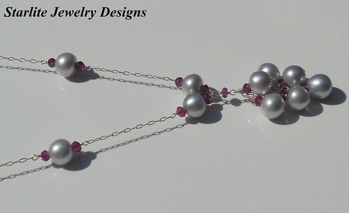
Accessories in grey, such as scarves, gloves, and handbags, add an understated elegance to any outfit. Silver-grey accessories in particular add a touch of class without overpowering the overall look, making them a popular choice in both men’s and women’s fashion.
6. Grey in Art and Visual Design
a. Grey as a Background
In visual design, grey is often used as a background color, as it doesn’t compete with other elements. It allows vibrant colors to stand out and creates a balanced composition. In graphic design, websites, and advertisements, grey backgrounds provide a neutral base that focuses attention on the main message.
b. Achieving Depth and Contrast
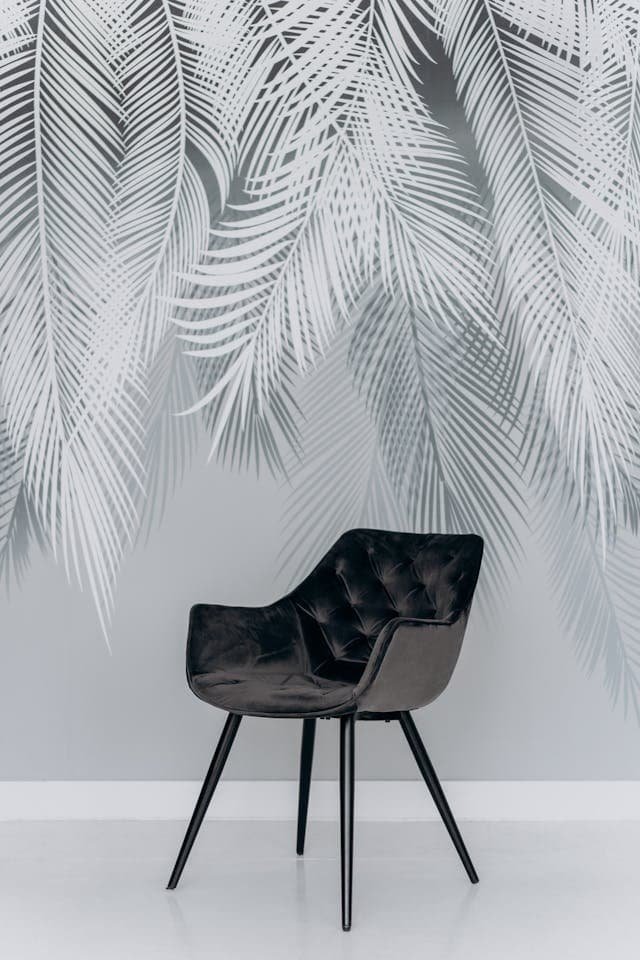
Grey is frequently used to create depth in artwork, as it can emphasize light and shadow effectively. Artists use varying shades of grey to build contrast, giving three-dimensionality to their work. A mix of dark and light grey can create stunning visual effects that evoke emotion and realism.
c. Symbolic Uses of Grey in Art
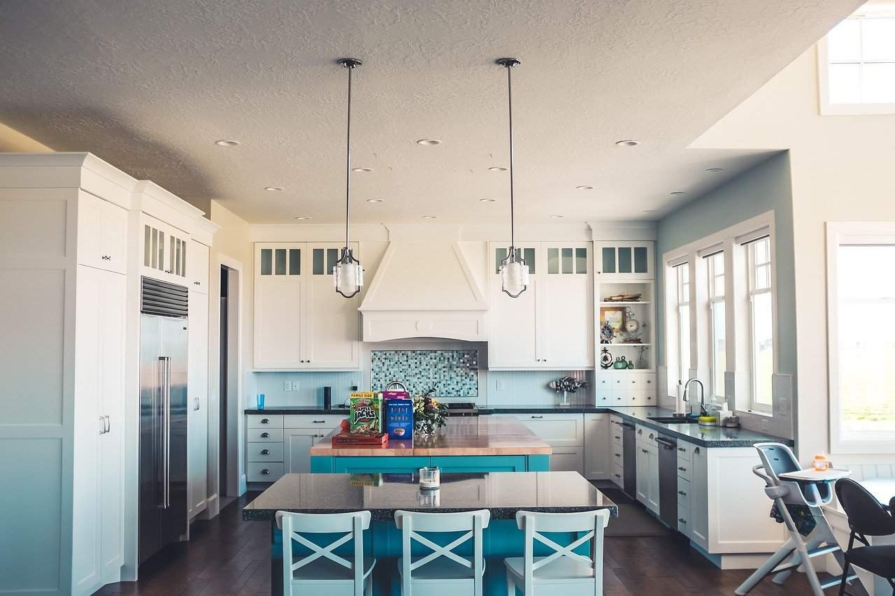
Grey is often used symbolically to represent mystery, ambiguity, or neutrality. In surreal and abstract art, grey can represent the unknown or an emotional state of in-betweenness. This neutrality allows artists to convey complex ideas and emotions without explicit definitions.

7. Grey in Technology and Branding
Grey is a dominant color in technology and branding. Many tech brands, such as Apple, use grey in their products and branding to create an image of sophistication, modernity, and simplicity. Silver-grey tones, in particular, are associated with sleekness and quality, which is why they’re used in gadgets like smartphones, laptops, and tablets.

In branding, grey is used to convey a message of professionalism and reliability. Banks, law firms, and consulting companies often use shades of grey in their logos and branding materials, as it reflects trustworthiness without being overly flashy or aggressive.
8. The Future of Grey: Trends and Predictions
Grey has established itself as a timeless color, and its popularity shows no sign of waning. With the shift toward minimalist and eco-friendly lifestyles, grey is expected to remain a dominant color in interior design, fashion, and product design. Soft, muted tones of grey are also predicted to gain popularity, as they align with the current trend of calm, neutral aesthetics in homes and workspaces.
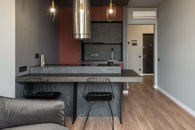
Another trend on the rise is pairing grey with earthy colors. As people seek to reconnect with nature, shades of grey are being combined with browns, greens, and terracotta’s to create serene, grounded environments that promote relaxation and well-being.
Conclusion: Embracing the Shades of Grey
The world of grey is much more complex and dynamic than it may seem at first glance. From its application in fashion to its symbolism in art, grey has a subtle yet powerful impact. Its range of shades allows for endless possibilities in design, art, and expression. Grey provides balance and elegance, offering a sophisticated neutrality that enhances other colors and tones. As we move forward, the many shades of grey will continue to evolve, reflecting changes in style, culture, and aesthetic preference.
Whether you’re choosing grey for your wardrobe, home, or creative project, the diverse shades of this color can help you express anything from calm and neutrality to boldness and depth. Embrace the nuances of grey and explore how this versatile color can add layers to your life, art, and personal style.
The Magic of Grey: Finding the Perfect Shade of Grey Paint for Your Home
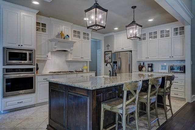
When it comes to interior design, few colors offer the versatility, sophistication, and modernity that grey does. Grey paint shades have soared in popularity, gracing the walls of countless homes around the world and serving as the perfect canvas for various interior styles—from classic and contemporary to minimalist and industrial. If you’re considering grey for your next paint project, this guide will help you navigate through the many shades and nuances of this complex, adaptable color.
Why Choose Grey?
Before diving into specific shades, it’s essential to understand why grey is such a sought-after choice for home interiors. Grey strikes a balance between warm and cool tones, blending effortlessly with other colors and materials. It has a unique ability to change its look and feel based on lighting, nearby colors, and even the time of day, making it one of the most dynamic colors in the interior design world.
Grey also possesses a timeless quality. While some colors fade in and out of fashion, grey has a staying power that ensures it will look fresh for years to come. Additionally, the spectrum of grey shades—from cool, blue-tinged greys to warm, taupe-like hues—means there’s an ideal grey for every space, mood, and aesthetic preference.
Types of Grey: Warm vs. Cool
To start exploring grey shades, it’s essential to understand the difference between warm and cool greys.
- Warm Greys: These shades have undertones of brown, red, or yellow, making them feel cozy and inviting. Warm greys are ideal for spaces where you want to create a welcoming atmosphere, such as living rooms, dining rooms, or bedrooms. Examples include greiges (grey and beige mixtures), taupes, and mushroom-like tones.
A complete guide about Warm Gray
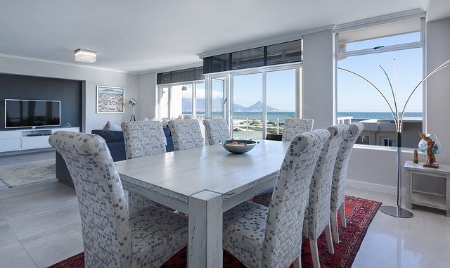
- Cool Greys: Cool greys are tinted with blue or green undertones, creating a crisp, modern vibe. They are often used in minimalist or industrial designs and work well in areas where you want a more sophisticated, serene feel, such as kitchens, bathrooms, or offices.
A Complete guide about Cool gray
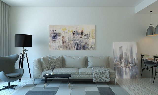
Both types of grey can look chic and stylish, but choosing between warm and cool shades should depend on the room’s purpose and the atmosphere you want to create.
Popular Shades of Grey Paint and Where to Use Them
The world of grey paint shades can be overwhelming, so here’s a breakdown of some popular and versatile options that can bring elegance, depth, and personality to your space.
1. Classic Light Grey
Light grey is an excellent choice if you want a subtle, neutral base that pairs well with almost any decor style. This shade is fresh, clean, and bright, making it perfect for smaller rooms or those with limited natural light, as it helps open up the space.
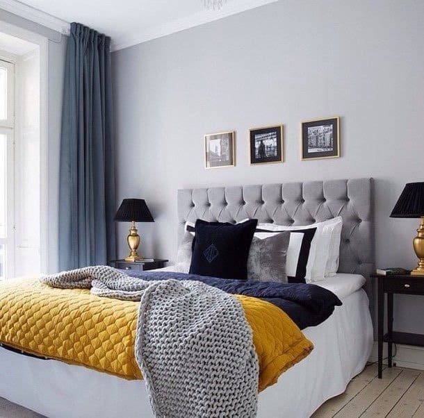
Popular Use: Light grey works wonderfully in living rooms and bedrooms, where you may want to keep a calming ambiance while allowing for accents in bolder colors.
Suggested Shade: Benjamin Moore’s Gray Owl or Sherwin-Williams Repose Gray. Both are soft, versatile, and provide a neutral foundation for virtually any style.
2. Greige (Grey and Beige Mix)
Greige is a hybrid of grey and beige and has become extremely popular for its ability to bring warmth without sacrificing the contemporary feel of grey. Greige shades are particularly versatile, as they can adapt to warm and cool decor, depending on what colors are paired with them.

Popular Use: Greige works well in transitional spaces, hallways, and entryways. Its adaptability makes it ideal for open-plan areas, seamlessly connecting different rooms.
Suggested Shade: Farrow & Ball’s Elephant’s Breath or Sherwin-Williams Agreeable Gray. Both have a warm undertone that makes spaces feel inviting yet contemporary.
3. Charcoal Grey
If you’re seeking a bolder, dramatic option, charcoal grey is a striking choice. It adds depth and sophistication without feeling as overpowering as black. Charcoal greys bring a refined touch and look especially striking when paired with contrasting white trim or bright accent colors.
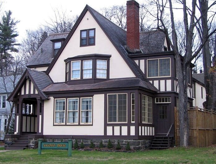
Popular Use: Charcoal grey is ideal for accent walls, home offices, or dining rooms where you want to create a more formal or intimate ambiance.
Suggested Shade: Benjamin Moore’s Kendall Charcoal or Sherwin-Williams Peppercorn. These shades offer a deep, rich tone that makes any space feel elevated and chic.
4. Blue-Toned Grey
Blue-grey shades are perfect if you’re aiming for a cool, serene environment. The hint of blue gives grey a relaxing feel, making it a popular choice for bathrooms, bedrooms, and home offices. Blue-greys can also add a coastal touch, perfect for homes aiming for a breezy, open feel.
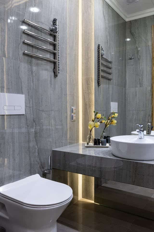
Popular Use: These shades are great for bathrooms and bedrooms, where a calm, soothing environment is desirable.
Suggested Shade: Behr’s Silver Drop or Farrow & Ball’s Pavilion Gray. Both offer a subtle blue undertone without overwhelming the grey, keeping the look sophisticated and calm.
5. Taupe Grey
Taupe grey has a hint of brown, which adds warmth and softness to the grey base. This color is an excellent choice for those who love earthy tones but still want a contemporary twist. It adds depth without feeling too dark or too light, making it a great middle-ground shade.
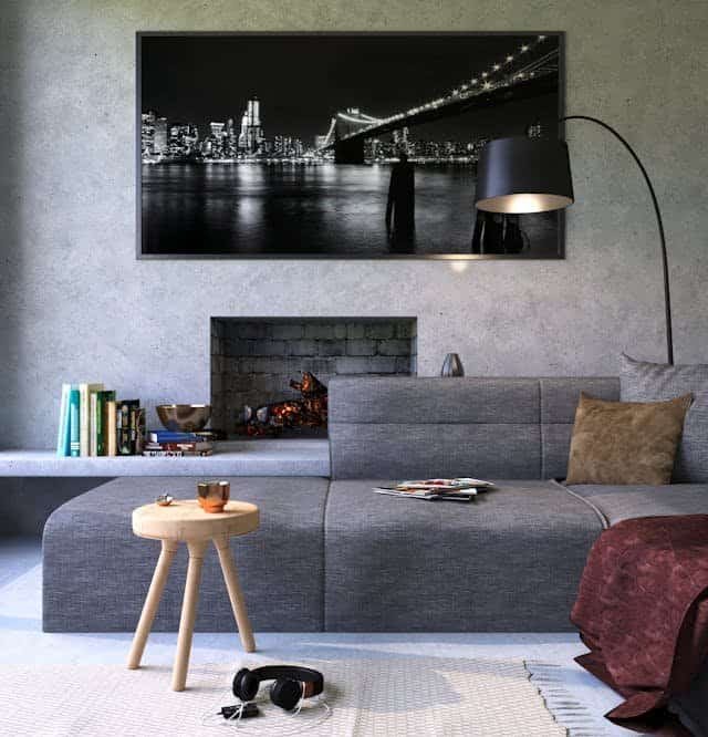
Popular Use: Taupe grey is ideal for living rooms, libraries, or cozy nooks. It works beautifully with natural wood and leather, creating a warm and welcoming environment.
Suggested Shade: Benjamin Moore’s Balboa Mist or Sherwin-Williams Mindful Gray. These shades offer an inviting, slightly warm tone that suits traditional and modern decor styles alike.
Tips for Choosing the Right Grey
With so many shades to choose from, it can be challenging to narrow down the right grey paint for your space. Here are some tips to help you make the perfect selection:
- Consider Lighting: Grey is a color that changes dramatically based on lighting conditions. A shade that looks perfect under bright natural light might appear darker or colder under artificial light. Try painting a small swatch on your wall and observe it at different times of the day to see how it interacts with your room’s lighting.
- Use Samples: Most paint brands offer sample sizes, allowing you to try out a few shades before committing to a full can. Applying a sample directly to your wall is the best way to see how a particular shade of grey will look in your space.
- Think About Undertones: Grey paint can have blue, green, purple, brown, or yellow undertones, which influence how the color appears. Consider what other colors will be in the room and choose a grey with undertones that complement them.
- Mind the Room’s Purpose: If you’re painting a living room or bedroom, you might want a warm grey to make the space feel cozier. For a bathroom or kitchen, a cool grey can give a crisp, clean look.
- Test with Your Decor: Grey is versatile, but certain shades may clash with specific furniture, rugs, or artwork. Make sure your chosen grey works harmoniously with your decor by placing sample boards near your decor items.
Grey Paint and Room Styles
The right shade of grey can beautifully enhance different interior styles.
- Modern and Minimalist: Cool, blue-toned greys or light neutral greys work well here, highlighting clean lines and minimalist furniture.
- Classic and Traditional: Greige or taupe-grey shades bring warmth while keeping the space elegant.
- Industrial: Charcoal greys or deeper shades offer an urban feel, especially when paired with metal, wood, and concrete.
- Coastal and Nautical: Soft blue-greys or light grey can reflect the sea and sky, offering a tranquil feel.
Conclusion
Grey paint shades have proven themselves to be some of the most adaptable and timeless options for home interiors. Whether you’re looking for something warm, cool, light, or dark, there’s a shade of grey that can elevate your space and match your vision. Taking the time to find the perfect grey will bring out the best in your decor, enhancing both comfort and style in any room.
